Elevating UX in People’s Bank App
Case study

Why People’s Bank mobile app?
The People’s Bank mobile app is one of Sri Lanka’s widely used banking apps, helping thousands of people manage their finances.
As someone who has used the app myself, I noticed it didn’t always offer the smoothest experience. Some tasks felt harder than they needed to be, and the overall design felt a bit outdated compared to other banking apps out there. That got me thinking what if I took this on as a UX case study?
What was my goal?
To explore ways to make the app more user-friendly, reduce friction in common tasks, and give it a more modern, intuitive feel. I wanted to understand real user pain points and reimagine a better experience.
What my role was?
UX researcher and UX designer.
Research
To understand the current status of the app, I started by asking friends and family who used the People’s Bank mobile app. Some said they were used to it, but when I asked more questions, they admitted it wasn’t always easy to use.
I also read through Play Store and App Store reviews to see what other users were saying. On top of that, I explored other popular banking apps like BOC, NDB, and international ones like Revolut and Payoneer to compare the experience.
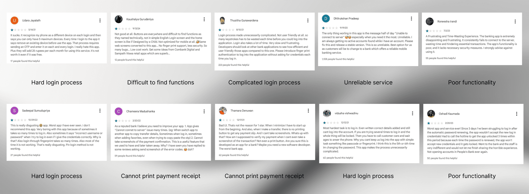
What Was the Problem?
The app was hard to use in many ways.
It’s hard to find basic information like account details or past transactions.
There’s no option to download proof of payment quickly.
The design looks old and cluttered.
The cash deposit process is confusing and takes too many steps.
Overall, the app doesn’t feel modern or smooth like other apps.
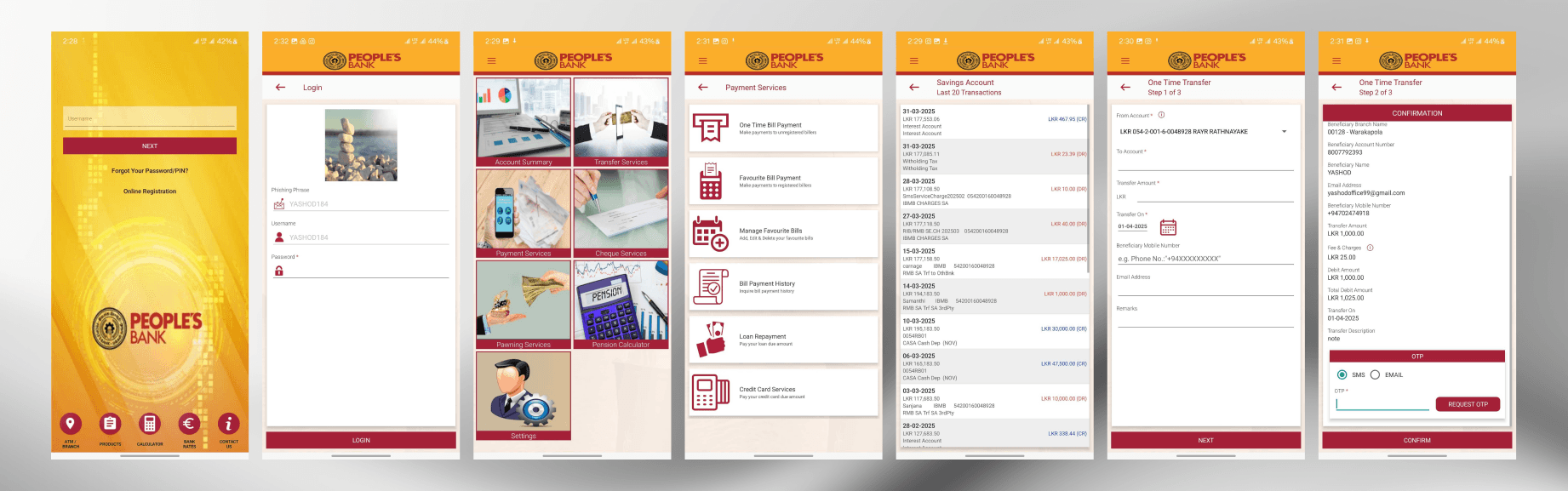
Current design 👇🏻
Why did this matter?
These issues made it frustrating for users to use the app. In a time where people expect smooth digital experiences, especially for something as important as banking, these problems can lead to users feeling annoyed, confused, or even losing trust in the app.
Digging Into the Problems
Bad navigation?
Yes, the app’s navigation is not user-friendly.
Some important features like transaction history or bill payments are hidden under menus that don’t make much sense. Users have to tap around just to find basic things. There's no clear flow, and it often feels like guesswork.
Not enough info?
Definitely.
When users check their transactions, they only see the basic details. They can’t easily view full payment info like reference numbers, descriptions, or dates. This becomes a big issue when someone needs to double-check a payment or report a problem.
Not being able to download proof of payment?
Yes, this was one of the biggest complaints.
There’s no quick way to download or share a payment receipt after sending money. This forces users to take screenshots, which is not secure or professional.
Screen Designing
Before starting the screen designing process, first I sketched the user journey for the new app.

Then designed wireframes for the new screens.
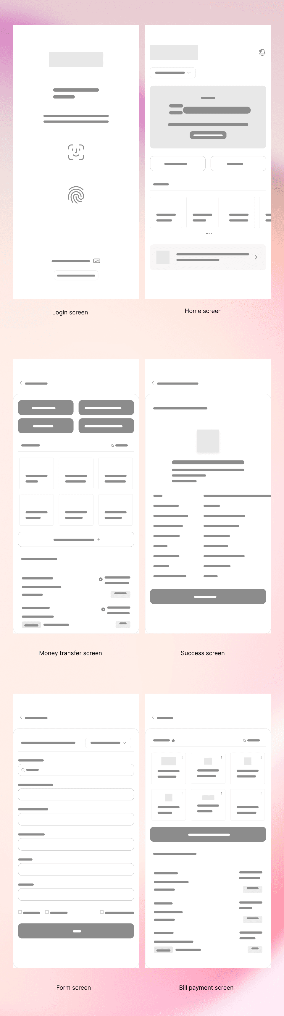
Finally, high fidelity designs for the screens.
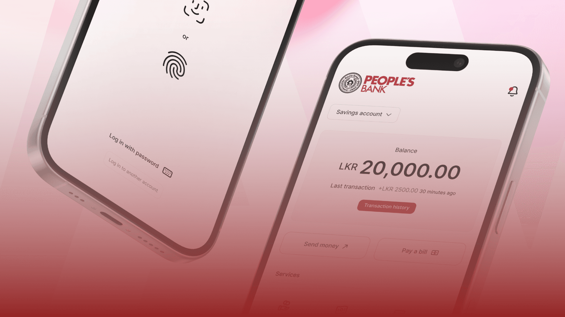
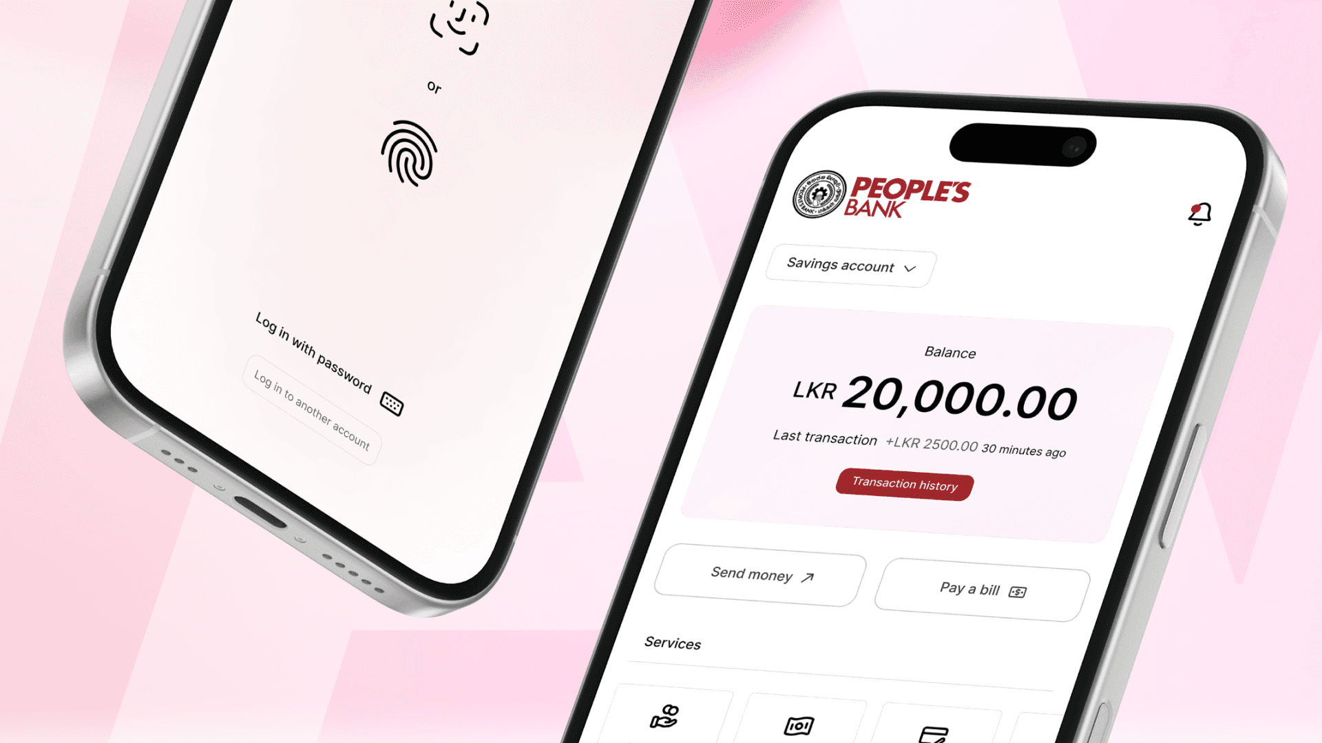
Login Screen – Easily login with one click.

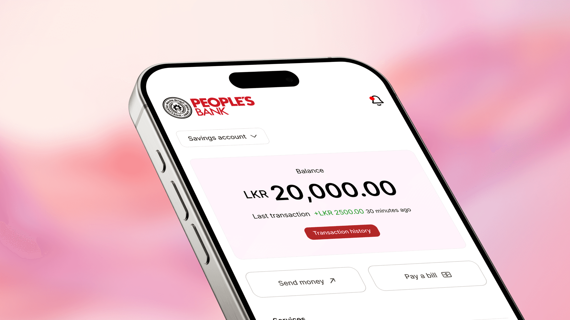
Home Screen – showing account balance, most recent transaction, and quick actions like transfer and pay bills.

Money transfer & Bill Payment – a clean and simple layout where users can easily send money or pay the bills with fewer steps.
Easy Navigation - Footer allows easily navigate between essential options inside the app.

Balance Check - Home screen show balance clearly without extra clicks.

Reciept Printing - A dedicated button to easily save reciept after tansfering money.

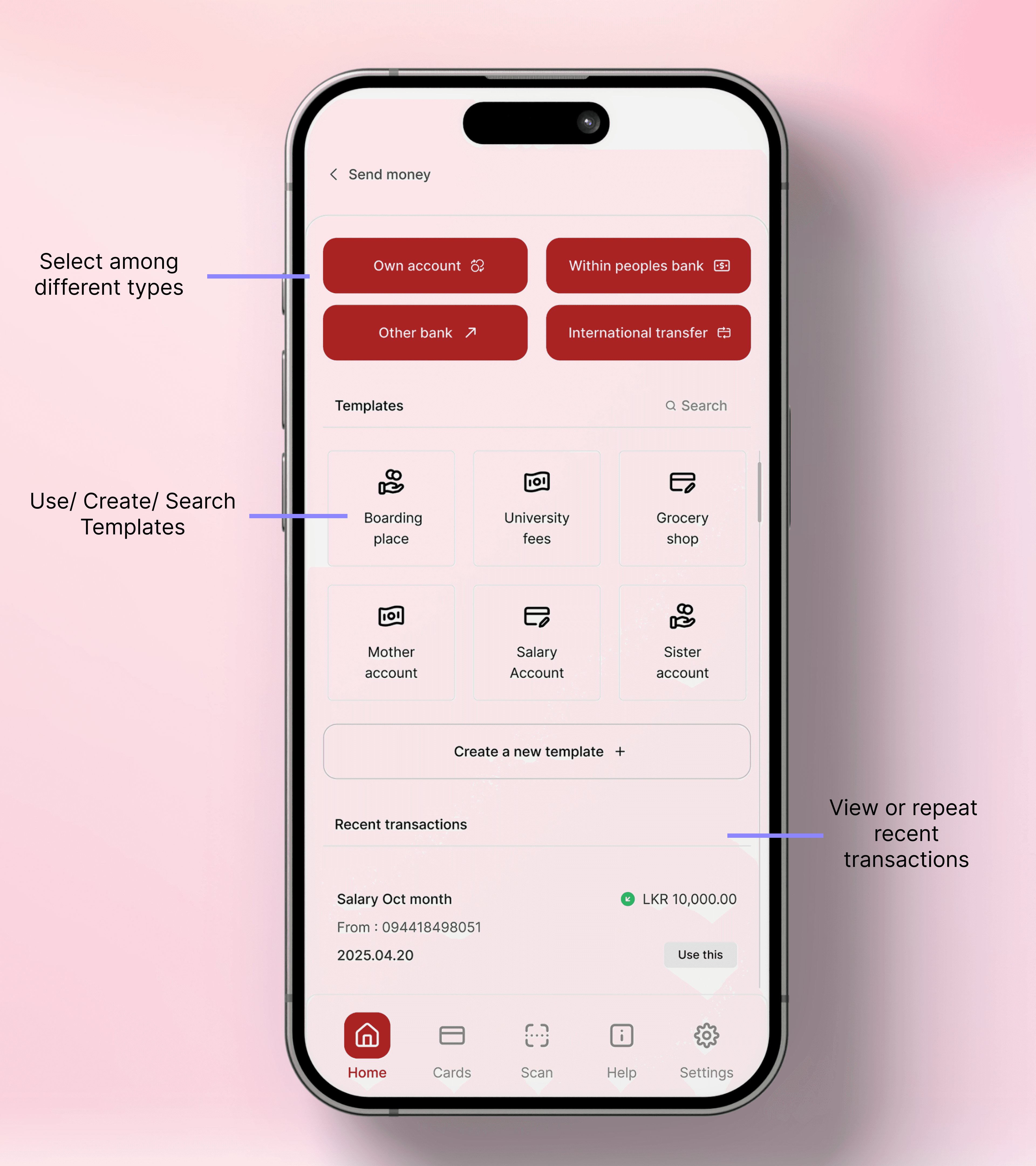
Apart from redesigning individual screens, I also focused on improving the overall user flows.
The money transfer flow in the original app was confusing and not user-friendly, so I worked on making it smoother and easier to follow.
Here, I’m showcasing the money transfer user flow I designed.

How it's more user-friendly now
Users can finish tasks faster with fewer steps.
The app feels more modern and easier to understand.
Important buttons and info are easy to find.
The design now feels more welcoming and helpful, which builds more trust with users.
What Changed?
Is the app easier to use?
After redesigning the app, tasks like checking your balance, paying bills, or transferring money became much easier and quicker. Users no longer had to go through too many steps or search around to find what they needed.
Did users understand it better?
The new layout uses clear icons, simple words, and helpful guidance. Even people who weren’t very familiar with apps could now understand how to use it without feeling lost.
If it’s just a concept, share what the improvements could lead to
Even though this is a concept redesign, it shows how a better user experience could help more people use the app instead of going to the bank. This could save time for both the users and the bank staff. A smoother app experience could also build more trust in the bank’s digital services and bring in more customers who prefer mobile banking.
Wrap-Up
This project was a great learning experience for me.
I got the chance to really understand how users feel when using a banking app and how small changes can make a big difference.
I was able to take an app that felt confusing and outdated and turn it into something smoother, clearer, and more helpful.
I learned how to listen to user needs, organize information better, and design with purpose.
Most of all, I learned that good design isn’t just about how things look, it’s about how they work for real people.
Categories
Mobile
Elevating UX in People’s Bank App
Case study
Why People’s Bank mobile app?
The People’s Bank mobile app is one of Sri Lanka’s widely used banking apps, helping thousands of people manage their finances.
As someone who has used the app myself, I noticed it didn’t always offer the smoothest experience. Some tasks felt harder than they needed to be, and the overall design felt a bit outdated compared to other banking apps out there. That got me thinking what if I took this on as a UX case study?
What was my goal?
To explore ways to make the app more user-friendly, reduce friction in common tasks, and give it a more modern, intuitive feel. I wanted to understand real user pain points and reimagine a better experience.
What my role was?
UX researcher and UX designer.
Research
To understand the current status of the app, I started by asking friends and family who used the People’s Bank mobile app. Some said they were used to it, but when I asked more questions, they admitted it wasn’t always easy to use.
I also read through Play Store and App Store reviews to see what other users were saying. On top of that, I explored other popular banking apps like BOC, NDB, and international ones like Revolut and Payoneer to compare the experience.
What Was the Problem?
The app was hard to use in many ways.
It’s hard to find basic information like account details or past transactions.
There’s no option to download proof of payment quickly.
The design looks old and cluttered.
The cash deposit process is confusing and takes too many steps.
Overall, the app doesn’t feel modern or smooth like other apps.
Current design 👇🏻
Why did this matter?
These issues made it frustrating for users to use the app. In a time where people expect smooth digital experiences, especially for something as important as banking, these problems can lead to users feeling annoyed, confused, or even losing trust in the app.
Digging Into the Problems
Bad navigation?
Yes, the app’s navigation is not user-friendly.
Some important features like transaction history or bill payments are hidden under menus that don’t make much sense. Users have to tap around just to find basic things. There's no clear flow, and it often feels like guesswork.
Not enough info?
Definitely.
When users check their transactions, they only see the basic details. They can’t easily view full payment info like reference numbers, descriptions, or dates. This becomes a big issue when someone needs to double-check a payment or report a problem.
Not being able to download proof of payment?
Yes, this was one of the biggest complaints.
There’s no quick way to download or share a payment receipt after sending money. This forces users to take screenshots, which is not secure or professional.
Screen Designing
Before starting the screen designing process, first I sketched the user journey for the new app.
Then designed wireframes for the new screens.
Finally, high fidelity designs for the screens.
Login Screen – Easily login with one click.
Home Screen – showing account balance, most recent transaction, and quick actions like transfer and pay bills.
Money transfer & Bill Payment – a clean and simple layout where users can easily send money or pay the bills with fewer steps.
Easy Navigation - Footer allows easily navigate between essential options inside the app.
Balance Check - Home screen show balance clearly without extra clicks.
Reciept Printing - A dedicated button to easily save reciept after tansfering money.
Apart from redesigning individual screens, I also focused on improving the overall user flows.
The money transfer flow in the original app was confusing and not user-friendly, so I worked on making it smoother and easier to follow.
Here, I’m showcasing the money transfer user flow I designed.
How it's more user-friendly now
Users can finish tasks faster with fewer steps.
The app feels more modern and easier to understand.
Important buttons and info are easy to find.
The design now feels more welcoming and helpful, which builds more trust with users.
What Changed?
Is the app easier to use?
After redesigning the app, tasks like checking your balance, paying bills, or transferring money became much easier and quicker. Users no longer had to go through too many steps or search around to find what they needed.
Did users understand it better?
The new layout uses clear icons, simple words, and helpful guidance. Even people who weren’t very familiar with apps could now understand how to use it without feeling lost.
If it’s just a concept, share what the improvements could lead to
Even though this is a concept redesign, it shows how a better user experience could help more people use the app instead of going to the bank. This could save time for both the users and the bank staff. A smoother app experience could also build more trust in the bank’s digital services and bring in more customers who prefer mobile banking.
Wrap-Up
This project was a great learning experience for me.
I got the chance to really understand how users feel when using a banking app and how small changes can make a big difference.
I was able to take an app that felt confusing and outdated and turn it into something smoother, clearer, and more helpful.
I learned how to listen to user needs, organize information better, and design with purpose.
Most of all, I learned that good design isn’t just about how things look, it’s about how they work for real people.
Categories
Mobile