FOSMIS App Design
Case study
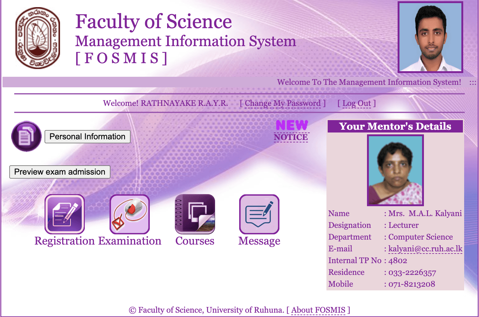
Currently, University of Ruhuna, Faculty of Science Management Information System (FOSMIS) operates through a web-based platform that provides students with access to essential academic services such as course registration, timetables, grades, announcements, and more. However, students often face usability challenges when accessing the system via mobile devices. The interface is not optimized for small screens, navigation feels clunky, and important features are often difficult to interact with on the go.
Recognizing these issues, I decided to design a dedicated mobile application that reimagines the existing FOSMIS experience with a student-first, mobile-first approach. This project aims to simplify access to academic tools, improve overall usability, and create an smooth experience that aligns with the daily digital habits of university students.
Current Design
Problem Statement
University students frequently access academic services on mobile, but the current MIS web system lacks mobile responsiveness, resulting in poor usability, navigation issues, and wasted time when completing basic tasks.
Objective
To design a user-friendly, mobile-first application that simplifies student interactions with the FOSMIS, ensuring quick access to essential academic features with a smooth and intuitive experience.
Target Users
University students (undergraduates & postgraduates) in the Faculty of Science
Research
By doing interviews and surveys with students and staff members, I was able to find out key problems they're facing with the current system.
Limited Accessibility
Inconvenient Updates and Notifications
Difficulty in Course Management
Communication Challenges
Reduced Engagement and Interactivity
Design Goals
Simplify core flows
Introduce a home dashboard with shortcuts to most-used features
Ensure accessibility, readability, and responsiveness on all screen sizes
Use simple typography and minimal UI to reduce learning curve
Key Features
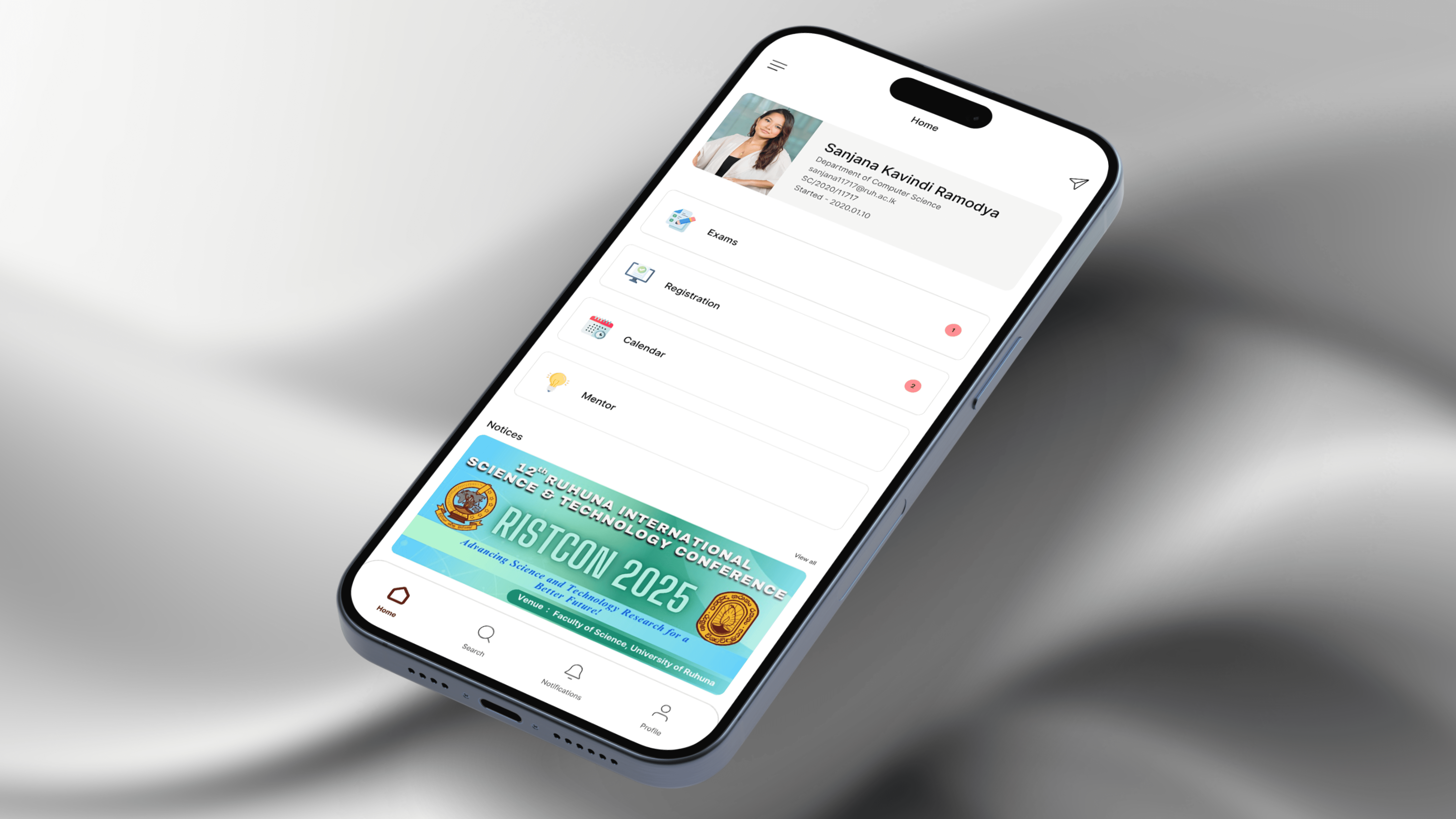
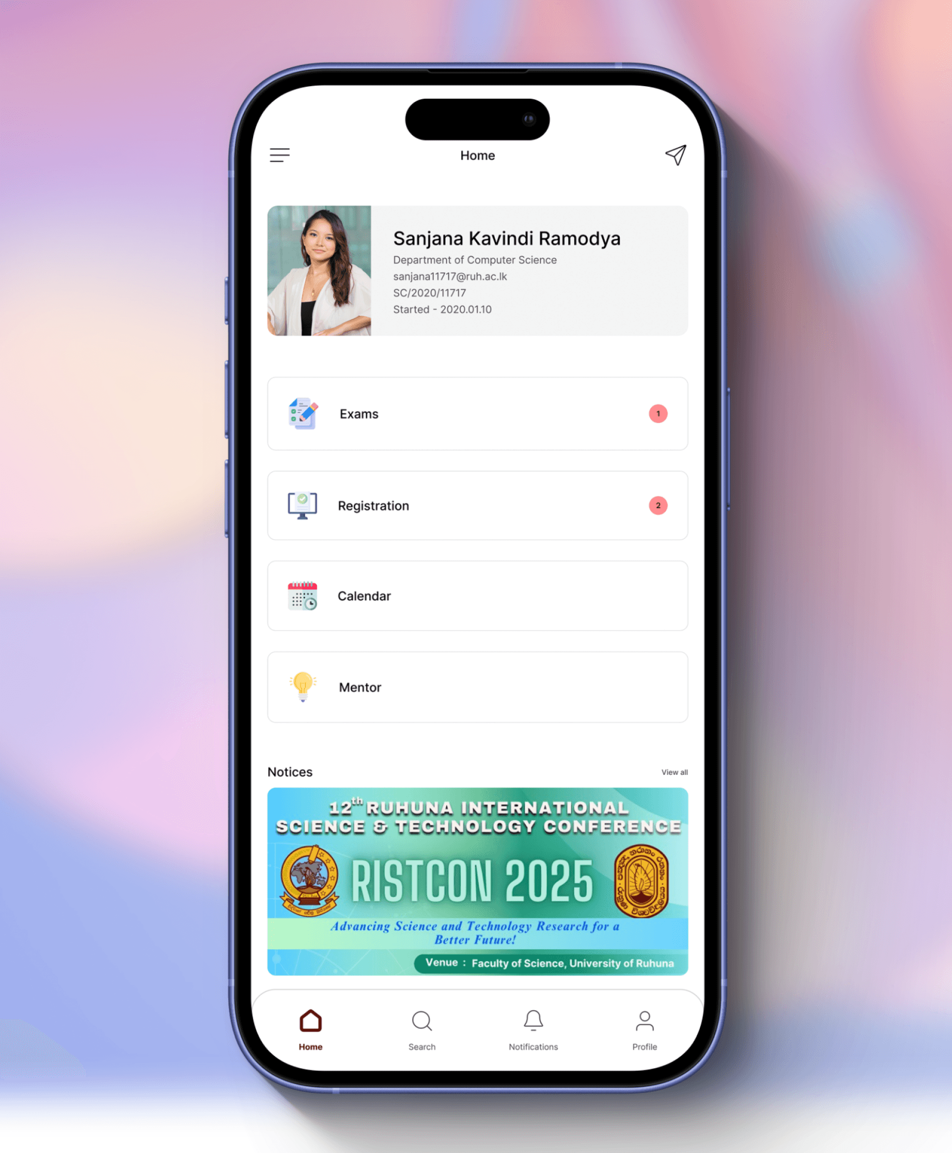
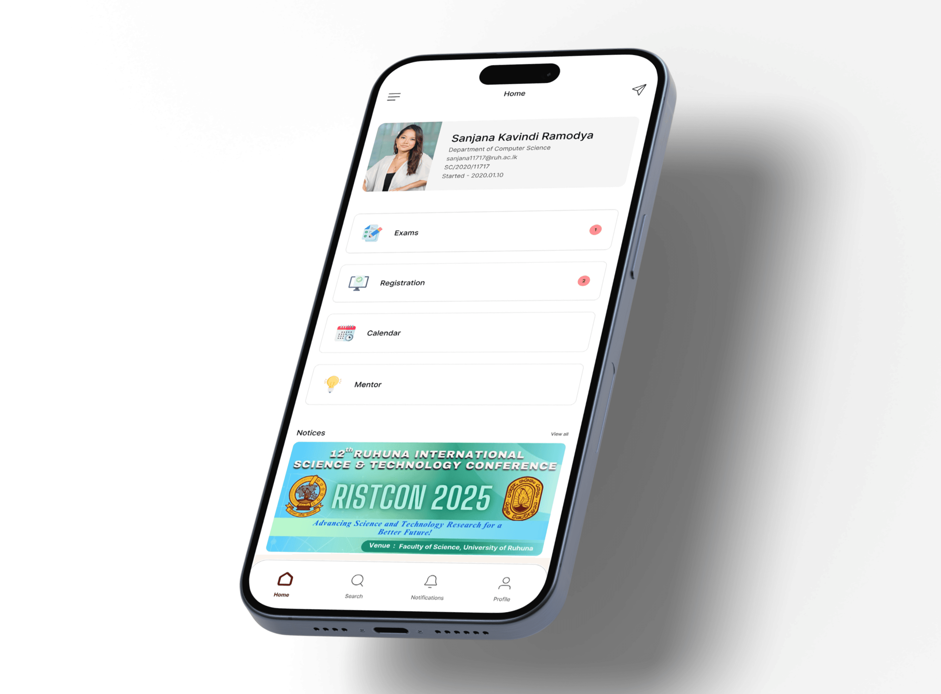
Dashboard
Registration
Timetable
Notifications
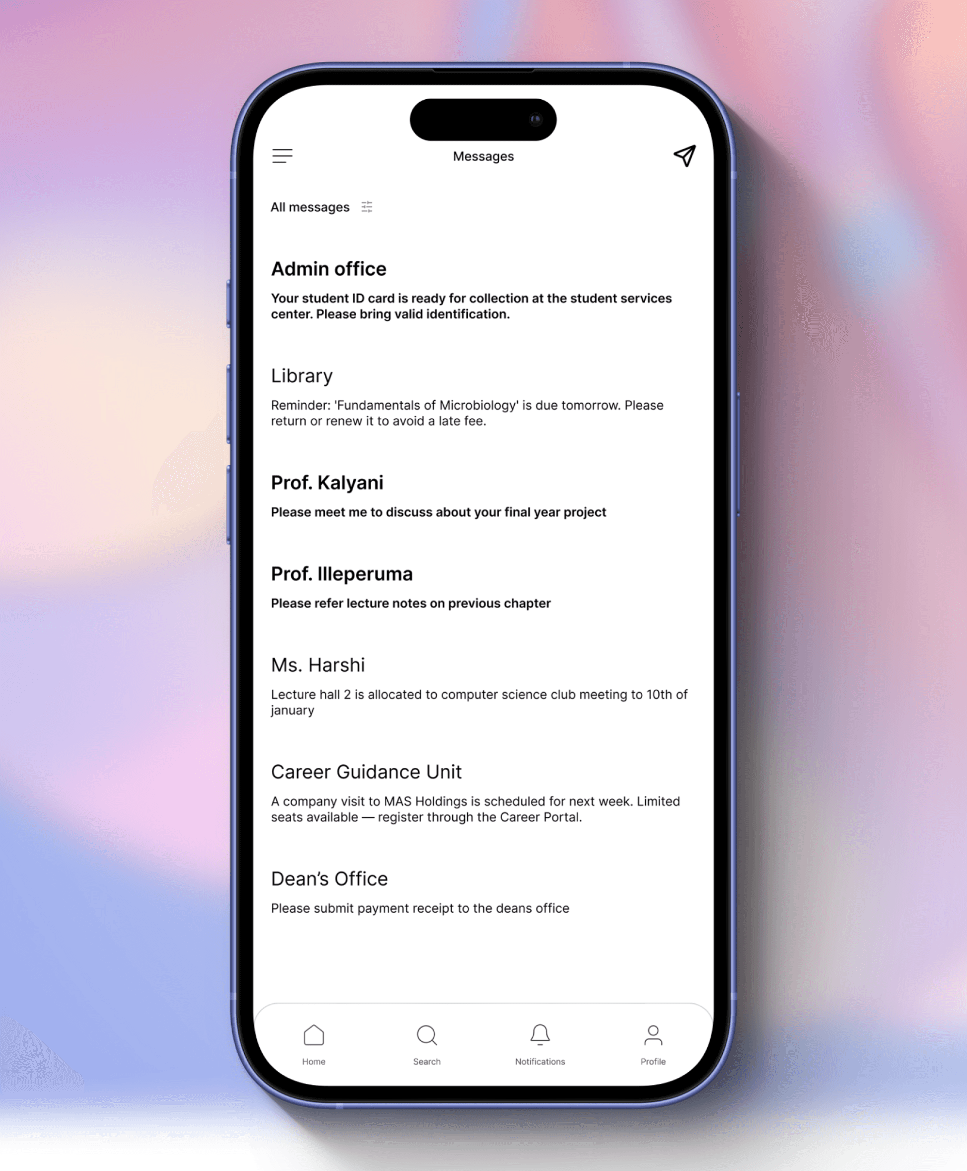
Messages
Design Choices
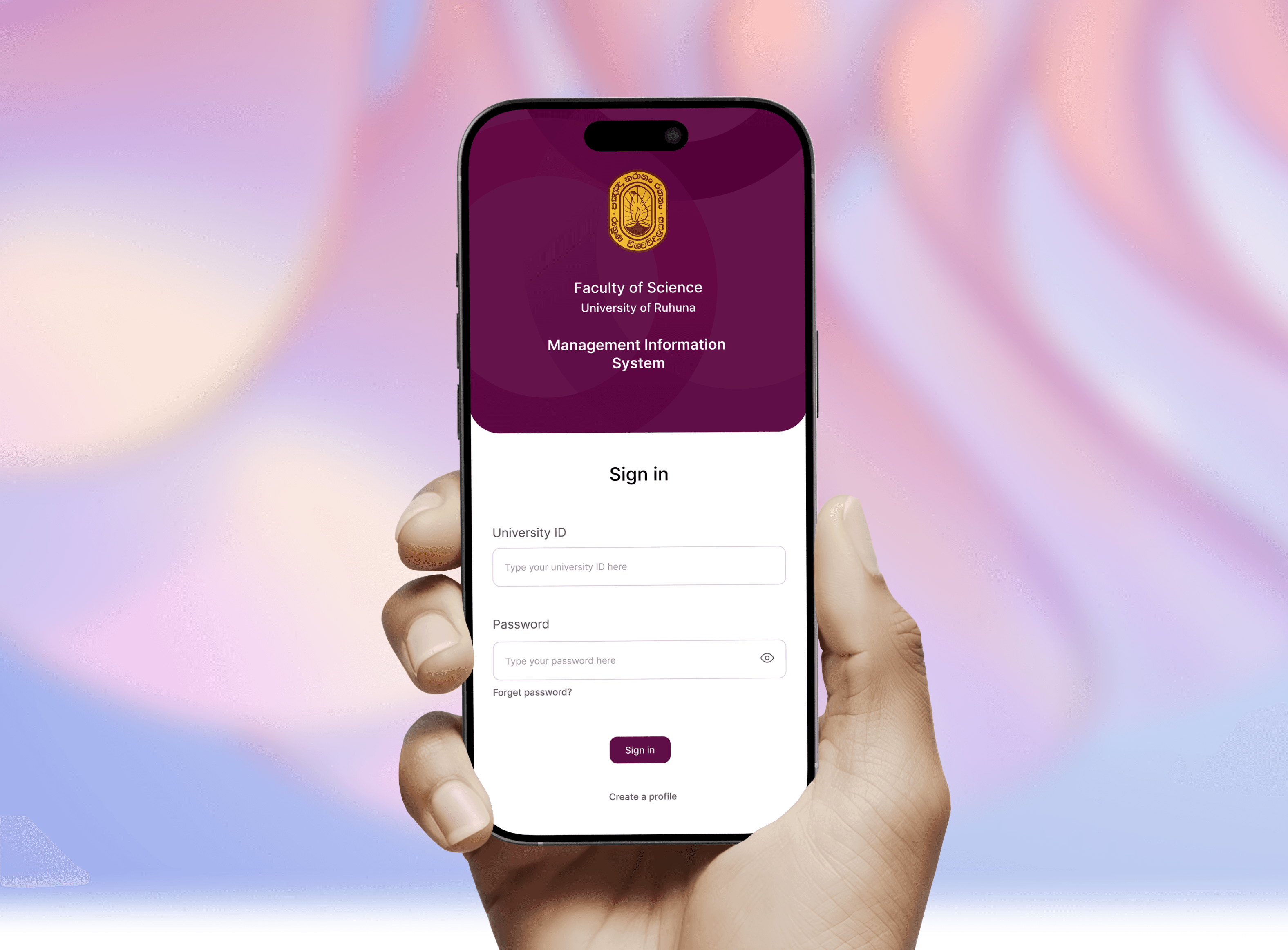
Color Palette – Calm flat colors to maintain focus and red color to brand identity
Typography – Clear, legible fonts with emphasis on hierarchy
Navigation – Tab-based bottom navigation for quick switching between core features
Accessibility – High contrast, scalable fonts
UI Designs
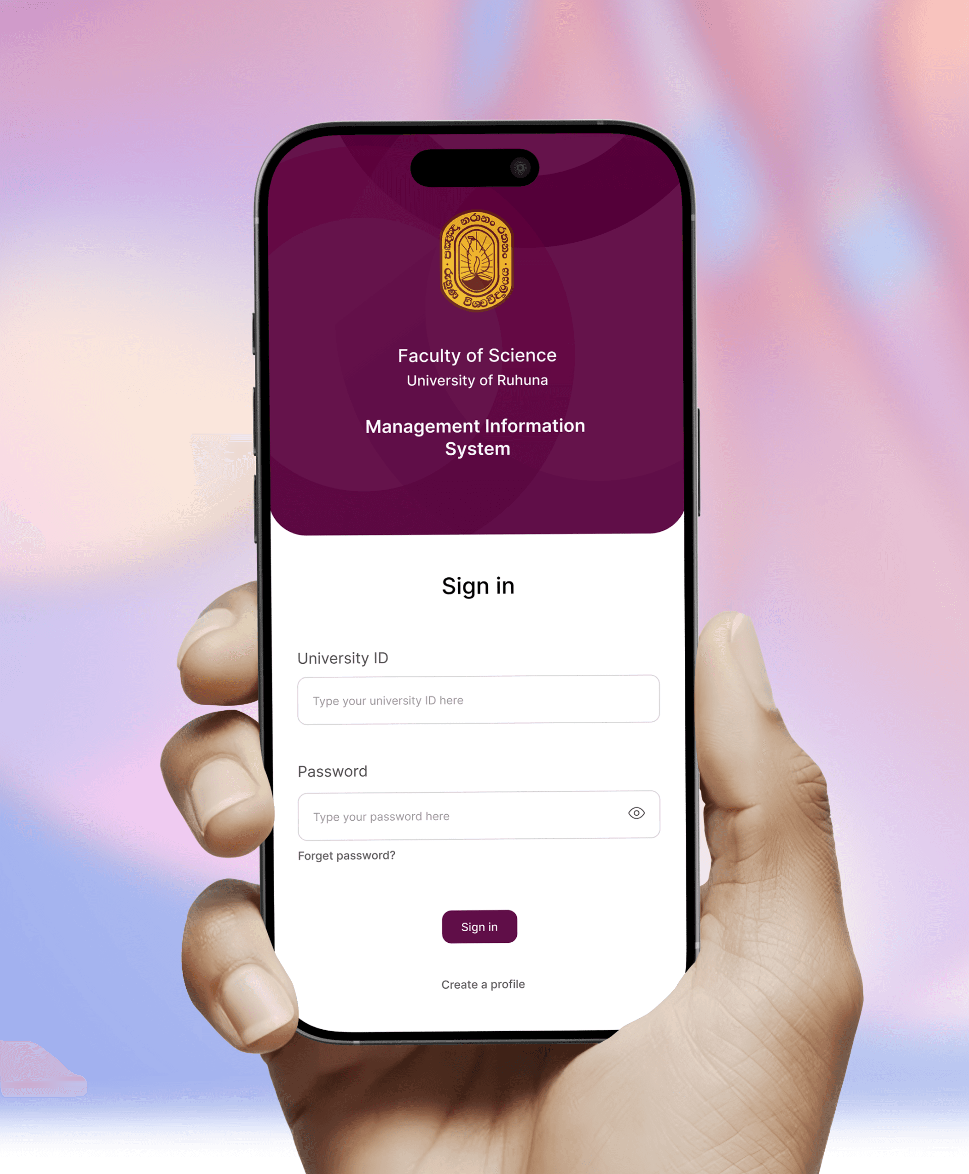
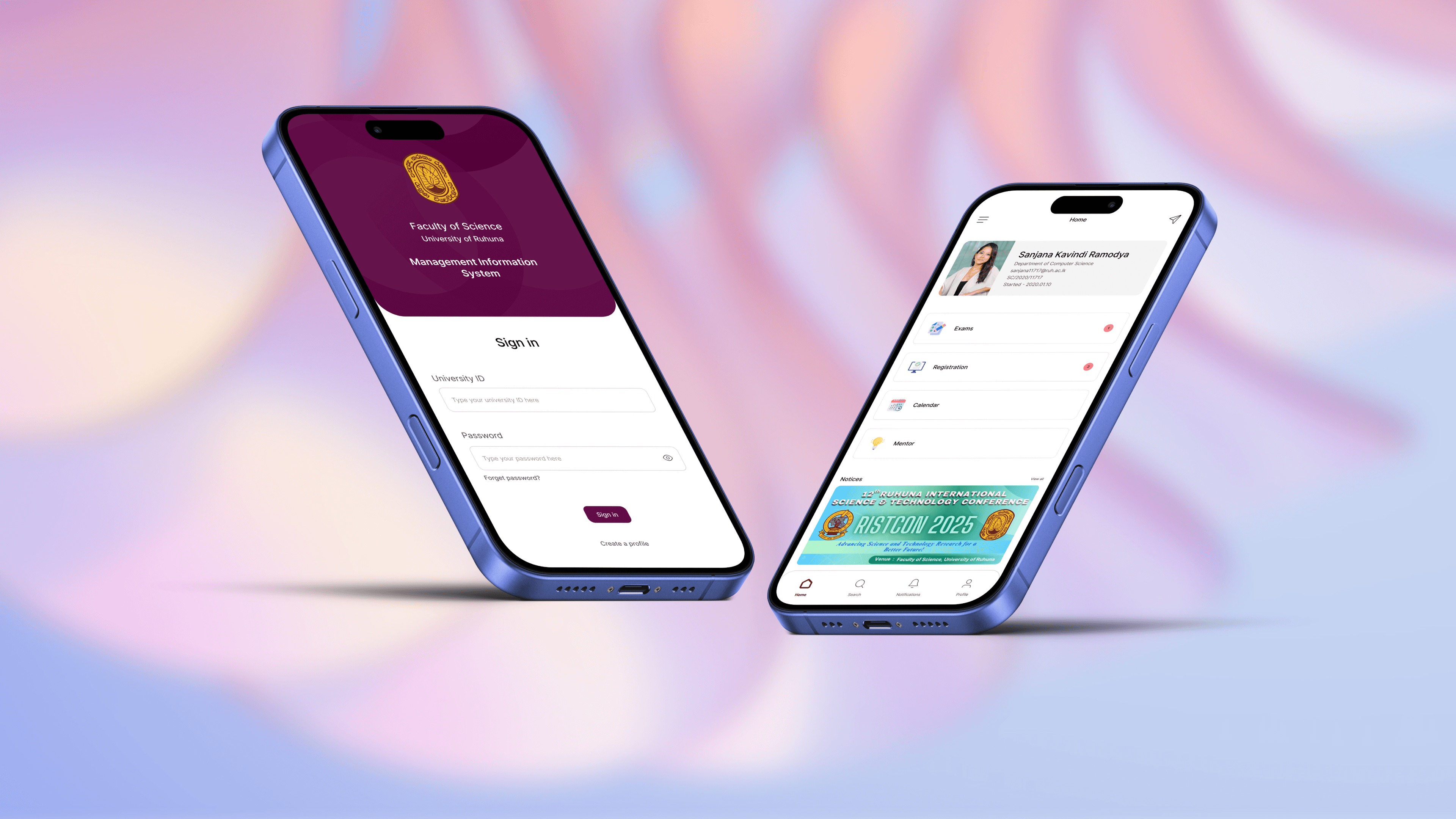
Login Screen
Home Screen
Search Screen

Notifications Screen

Messages Screen
Next Steps
Integrate with university backend APIs
Pilot release with limited student group
Collect usage analytics for further refinement
Tools Used
Figma
Notion
Google Forms
Google Docs
Categories
Mobile
App design
FOSMIS App Design
Case study
Currently, University of Ruhuna, Faculty of Science Management Information System (FOSMIS) operates through a web-based platform that provides students with access to essential academic services such as course registration, timetables, grades, announcements, and more. However, students often face usability challenges when accessing the system via mobile devices. The interface is not optimized for small screens, navigation feels clunky, and important features are often difficult to interact with on the go.
Recognizing these issues, I decided to design a dedicated mobile application that reimagines the existing FOSMIS experience with a student-first, mobile-first approach. This project aims to simplify access to academic tools, improve overall usability, and create an smooth experience that aligns with the daily digital habits of university students.
Current Design
Problem Statement
University students frequently access academic services on mobile, but the current MIS web system lacks mobile responsiveness, resulting in poor usability, navigation issues, and wasted time when completing basic tasks.
Objective
To design a user-friendly, mobile-first application that simplifies student interactions with the FOSMIS, ensuring quick access to essential academic features with a smooth and intuitive experience.
Target Users
University students (undergraduates & postgraduates) in the Faculty of Science
Research
By doing interviews and surveys with students and staff members, I was able to find out key problems they're facing with the current system.
Limited Accessibility
Inconvenient Updates and Notifications
Difficulty in Course Management
Communication Challenges
Reduced Engagement and Interactivity
Design Goals
Simplify core flows
Introduce a home dashboard with shortcuts to most-used features
Ensure accessibility, readability, and responsiveness on all screen sizes
Use simple typography and minimal UI to reduce learning curve
Key Features
Dashboard
Registration
Timetable
Notifications
Messages
Design Choices
Color Palette – Calm flat colors to maintain focus and red color to brand identity
Typography – Clear, legible fonts with emphasis on hierarchy
Navigation – Tab-based bottom navigation for quick switching between core features
Accessibility – High contrast, scalable fonts
UI Designs
Login Screen
Home Screen
Search Screen
Notifications Screen
Messages Screen
Next Steps
Integrate with university backend APIs
Pilot release with limited student group
Collect usage analytics for further refinement
Tools Used
Figma
Notion
Google Forms
Google Docs
Categories
Mobile
App design